Benjamin Moore Classic Gray: The Perfect Neutral For Any Room
Looking for the Benjamin Moore Classic Gray home inspiration? Awesome because I’m sharing all the rooms we used this greige color in!
If you’re looking for the perfect greige to update any room in your home Benjamin Moore Classic Gray OC-23 is for you. The color greige is a combination of beige and grey.
It’s fabulous to transition from the dated Tuscan trend (speaking from experience) or any other look. Depending on the lighting of your room it’ll have a different appearance.
Overall this color has warm undertones and can appear almost purple when it first goes on the wall. I have to admit I was scared at first, especially since we painted the entire first floor in Classic Gray.
After about a week, the color settled and it was absolutely beautiful. Anytime you paint a room it’s important to wait until everything is back in place before you judge it.
To help you decide if this color is right for you I’ve pulled together my favorite images to inspire your next project. The transformation it had in our home was quite dramatic if I do say so myself.
This post is all about Benjamin Moore Classic Grey OC-23.
READ MORE>>> Home Design Inspiration On Inspired Design Talk
This post may contain affiliate links, which means that if you make a purchase, I might make a small commission at no extra charge to you. Please read my full disclosure here. As an Amazon Associate, I earn from qualifying purchases.
Is Benjamin Moore Classic Gray warm or cool?
Benjamin Moore’s classic grey is a warm neutral color. The popular color is classified as off-white in the Benjamin Moore paint deck but it’s anything but.
When paired with Simply White OC-117 trim it’s easy to see the contrast and barely there gray color. It’s soft and soothing, perfect for any modern contemporary space.
Is classic gray more gray or beige?
Classic gray is more on the gray side than beige. It skews on the warmer side, especially in dimly lit rooms.
It does have a violet undertone that may be noticeable when the paint is first applied. I have to admit I was a little nervous at first but trusted the process.
Once the second coat was applied and dry I was pleasantly surprised by the finished product. It’s the perfect neutral to complement the hard finishes in our home.
Is greige still popular in 2025?
Yes, greige is still popular in 2025 and it can be found on walls, cabinets, trim, and more. Whether you’re designing with beige or gray neutrals it’ll be the perfect compliment.
The trendy neutral looks great combined with white, gray, and black. It also pairs well with warm brown tones if that’s more of your vibe.
If you prefer a pop of color, it goes great with turquoise, blue, and pink accents.
Once you have your measurements you’ll be able to order your furniture with confidence. This video will help you create a floor plan based on the measurements of your space.
Classic Gray With Simply White Trim
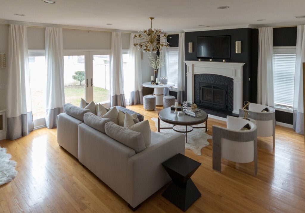
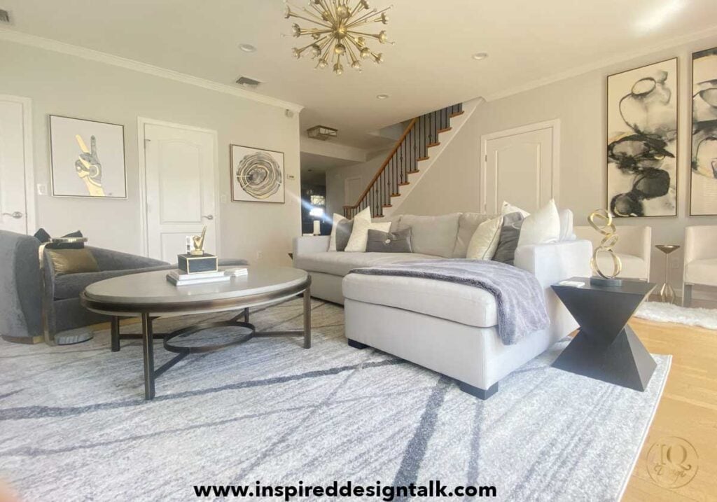
The living room above features classic grey walls in a matte finish with simply white trim in a satin. If your space is high traffic or you have children then use eggshell on the walls with semi-gloss trim.
It’ll be more forgiving especially when it comes to fingerprints and wiping the walls. Since we’ve passed the entertaining and little kids stage we don’t have to worry about that.
In this design, there’s a combination of both warm and cool grey tones. You can see the difference between the yellow undertone of the walls and the cooler grays in the area rug.
It’s okay to mix the two in your space as well. You just need to remember to balance the different tones throughout the room.
This will help create flow and movement in your design. Another tip is to layer in texture and pattern when designing with neutrals.
There are fur, velvet, linen, and twill fabrics that create highs and lows. Mixed metals are also used throughout the space along with wood and cement.
The color palette is warm and inviting with white, black, grey, and beige. Touches of silver and gold are used to complete the look.
Benjamin Moore Classic Gray With Black Accent Wall

The original space of the room above was designed during the Tuscan trend. There was A LOT of slate and warm colors. To update the look into a classic, timeless neutral palette, the slate was painted black.
For that, gripper primer was used to seal the slate. Then, black semi-gloss paint was applied to the tile and grout lines.
This was an affordable solution that got the results we were after. Changing out the slate for a more modern tile would have cost way more.
The other change was adding the black accent wall. For that, we used Benjamin Moore Obsidian Century paint, which has since been discontinued.
I love using new products but I have to say that when they stop making them, it becomes problematic. I thought the Century paint was fabulous.
We do have some left, so it should be ok if we need to do any touch-ups. It complements the BM Classic Gray walls perfectly.
Now that the wall is black, it camouflages the TV, which just blends in. My husband loves a good TV moment and would probably cry if it were ever removed.
The black wall is softened by the cream linen drapery panels with the gray faux silk border. There’s also the white fireplace, which was painted in Simply White OC-117 in a semi-gloss finish.
During the Tuscan period, the trim was White Dove OC-17, which has yellow undertones. Simply white is a crisp color that makes the classic gray pop in the room.
Classic Gray With Wallpaper Accent Wall

When you first enter our home, the sitting room is the first space you’ll see. In the previous design, it had rust Venetian plaster that was a b_tch to change out.
The walls had to be skim-coated, primed, and then painted. Here we also used Benjamin Moore Classic Grey OC-23 in the matte finish.
This was paired with a grasscloth wallpaper accent wall in a silver metallic. This came out stunning! Since wallpaper is not cheap and this space is open, we opted for one wall as opposed to the entire space.
It would have been too much and overkill to do all the walls. The front sitting room still uses neutrals but there are pops of color pulled out from the Leftbank Artwork.
Classic Grey looks fabulous paired with navy, blue, and fuchsia pink. This space also has mixed metals and black accents that tie back to the living room design.
Benjamin Moore Classic Gray Living Room

The sitting room has a large window that lets in plenty of natural light. The lighting in your room will definitely affect the way the color appears.
The living room has sunlight from the east which is super bright in the morning. In the afternoon, the sitting room has a brighter light which changes the color throughout the day.
For this reason, it’s super important that you always check the wall color in your home at different times of the day. Don’t just paint a box on the wall either!
The best way to decide the color of your walls is to get sample boards from your local paint store. Purchase the tester samples and paint two coats on the boards.
Then take those boards and place white cardstock behind them. Move it around your room and look at the color at different times of the day.
It’s best to test a few colors so you can compare and see the difference between them. Once you have the one you love, it’s time to order and get painting!
By now you know I’m a huge fan of BM Classic Gray OC-23 which is why we used it on the entire first floor including the kitchen, living room, Airbnb, and hallway. It was a dramatic change that made the entire space light and airy.
Classic Gray Hallway

Benjamin Moore Classic Gray OC-23 was also used in the hallway. The main floor has an open floor plan so using one color in the entire area makes it feel more expansive.
The stair risers and crown molding have Simply White OC-117 in a semi-gloss finish. In this image, you can see the difference between the two tones.
Even though Classic Gray is a part of the white tones in the color deck it’s a gray-beige blend. It’s also the perfect neutral backdrop for the gallery photo frames that are in the plans.
The beauty of one color in an open floor plan is it creates flow and consistency. Gone are the days of the choppy tones of color that close a space in.
Embrace the expansion and feel the abundance!
Airbnb With Classic Gray Walls

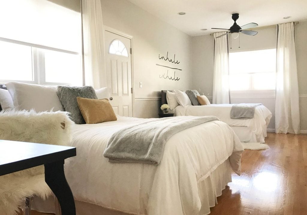
Another area where we used Classic Gray was in the Airbnb bedroom space. This area used to be an office but after the kids moved out we realized the home was too big and there was a lot of wasted space.
So we moved the office upstairs and converted the room into a bedroom. We wanted to appeal to the masses, and the best way to do that is with a neutral color palette.
The transformation of this area was quite dramatic. There are 9-foot ceilings in this room so the light color opened it up.
Again a neutral color palette was used with greige, white, black, gray, and touches of gold throughout. When creating a space for Airbnb light and airy is the goal.
Remember people are scrolling through the app and will stop at the image that resonates with them. The cleaner and more inviting your space looks the more bookings you’ll get.

Benjamin Moore Classic Gray Transformation
Now that you’ve seen all the areas where we used Benjamin Moore Classic Gray to update our home, let me show you the real transformation. Seeing the after images is one thing but in our case, the before and after were super dramatic.
Below are before and after images of the spaces above. Paint is by far the cheapest way to make a huge impact in any room.
In our case, we changed the furniture and decor so the rooms were completely transformed. They literally could have been an episode of HGTV’s before and after series. Just saying!
BM Classic Gray Living Room Makeover


The living room makeover was quite the transformation. When we first remodeled our small ranch we had no money to buy new furniture so we had to work with what we had.
That said I invested in every painting technique there was at the time. No like literally Every. Single. One. Oh, and I did them all myself.
Back then there was no YouTube tutorial on how to create anything so I read a ton of books and brochures from the paint store. They had step-by-step instructions with really good photos.
In the living room, there was a faux finish that took forever to complete. The fireplace was a solid shade of rust and the entire look was an analogous color story.
Shades of yellow, orange, rust, and burgundy all flowed into one another. Aside from my obsession at the time with the Tusacn trend and just that Spanish wrought iron in general, I may have subconsciously been trying to make the size smaller.
As a rule, darker colors will close in a space and make it feel cozy, while lighter colors expand and make it feel larger. You can see the difference in the image above.
BM Classic Gray Dining Room Makeover


As I mentioned above the dining room was Venetian plaster, which was quite the process to change. It had to be skim-coated before it was primed and painted.
Even the wallpaper wall had to be prepped properly because if there were defects underneath, they would show through. At first, I thought I’d be able to handle this transition on my own BUT quickly realized the job was massive and completely beyond my level of expertise.
At that point, I had nothing to prove and knew we needed to hire a pro. Luckily my husband came through and got us the help we needed before I had a nervous breakdown.
I should also mention that during this time, I was in the process of transitioning out of a twenty-three-year career as a fashion designer.
I had gotten my degree in interior design, but it took some time before I was ready to leave the world of fashion. That had been a part of my identity for so long that it took a minute to let it go.
We got sidetracked, but the point I was making is I was using my home as a portfolio. During this time, I was learning the process of working with trade accounts and design from start to finish.
This makeover was a great way to show my style and personality. It was also the way I could showcase my talent and update my website.
Change Is Good
So with this transformation came the furniture and home decor we weren’t able to afford the first time around. The combination of the Classic Grey paint update and the new style completely changed the vibe in our home.
Out with the Tuscan Trend and in with the contemporary modern style. Cheryl Eisan and Kelly Hoppen were the inspiration for the look and feel I was after.
BM Classic Gray Hallway Makeover


This image is another example of the dramatic impact of BM Classic Gray in our home. The vibe has been completely updated to a more modern, minimalist approach.
Gone are the tchotchkes extras that felt dated and overbearing. There’s a new look of flow and modern elegance that was a welcome change.
Aside from changing out the paint color in a room, lighting is another way to make a dramatic impact. Depending on the fixtures you choose, this can be a super affordable way to update your home.
Final Thoughts
I waited several years to give my thoughts on Classic Grey because I wanted to give an honest opinion. Given the hard finish of the tile and granite we have in the kitchen, it truly was the best choice to update our home.
I couldn’t be happier with the results and hope this is helpful as you go on your decorating journey. Happy designing, my friends!
This post is all about Benjamin Moore Classic Grey.
Other Posts You’ll Love:
Last Updated on June 10, 2025 by Nicole DelaCruz


